Case Study: Complete Signage Package for Antara Cafe Kopitiam, Setia Tropika Johor Bahru
Project Overview
Antara Cafe Kopitiam’s identity is built around a clean, modern take on the traditional kopitiam experience — which made signage consistency particularly important. Every piece needed to carry the same brand colour (deep red on white), the same illustrative character design, and a level of finish that matched the quality of the cafe’s interior fit-out.
A&T handled the full signage scope — from the large outdoor frontlit main signboard down to the decorative cube lightboxes mounted on the interior feature wall.
Scope of Work
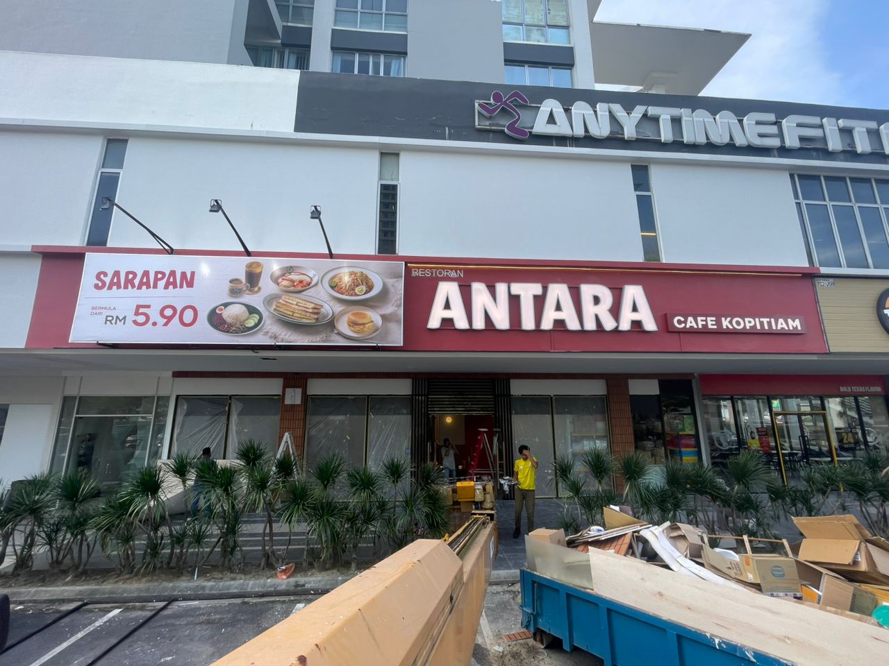
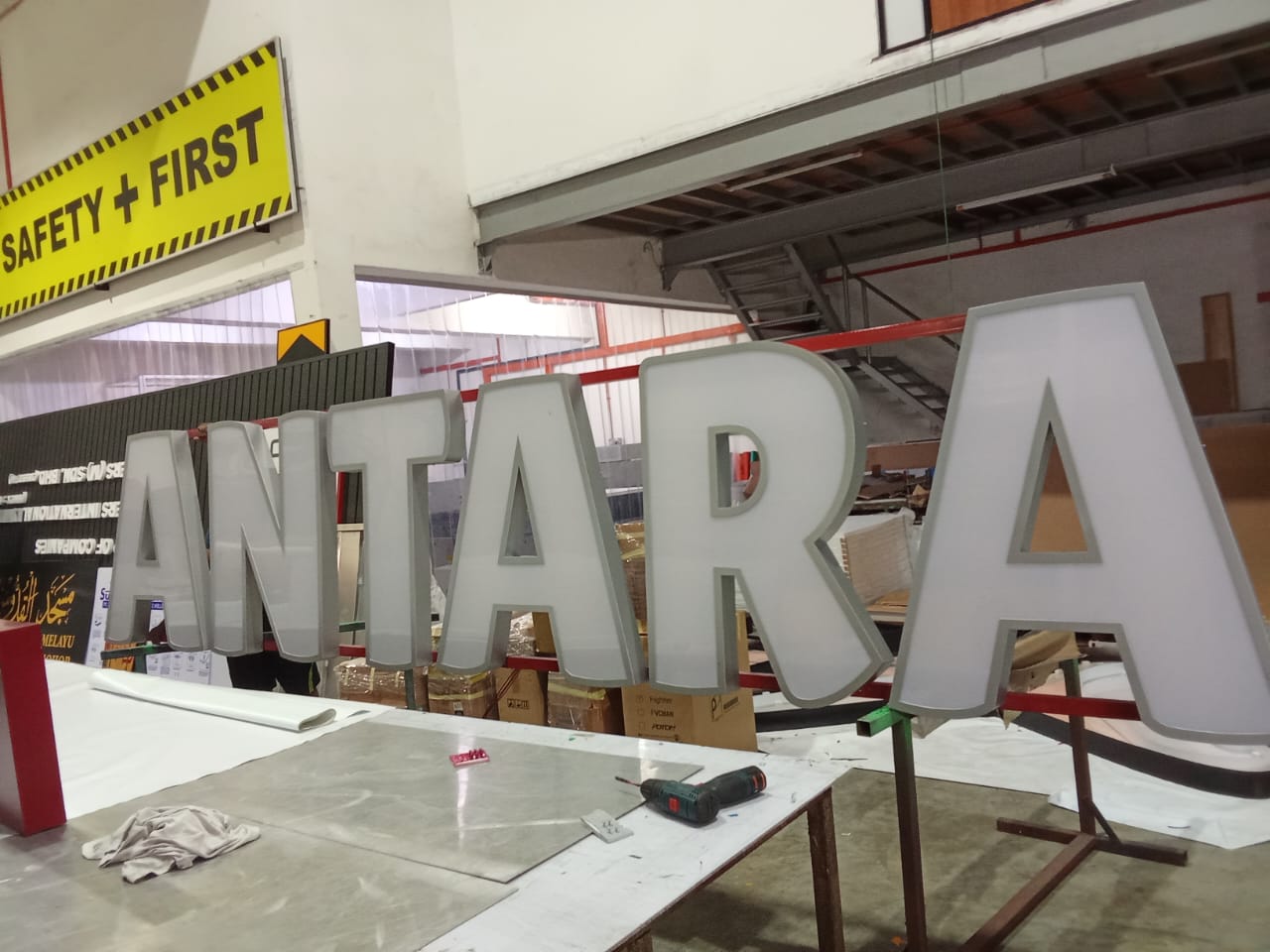
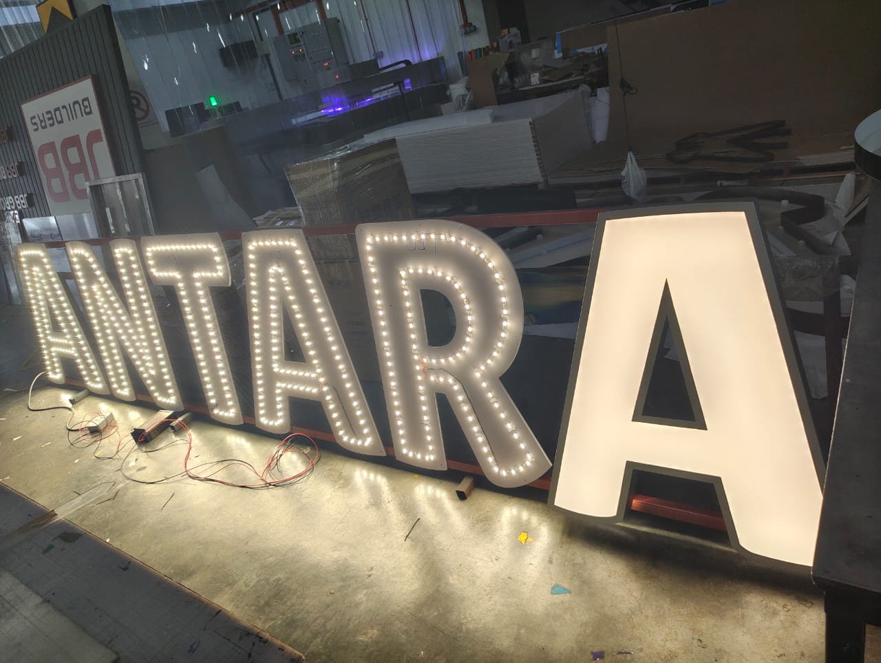
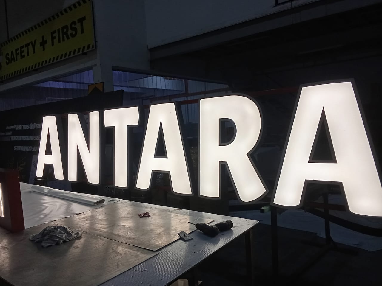
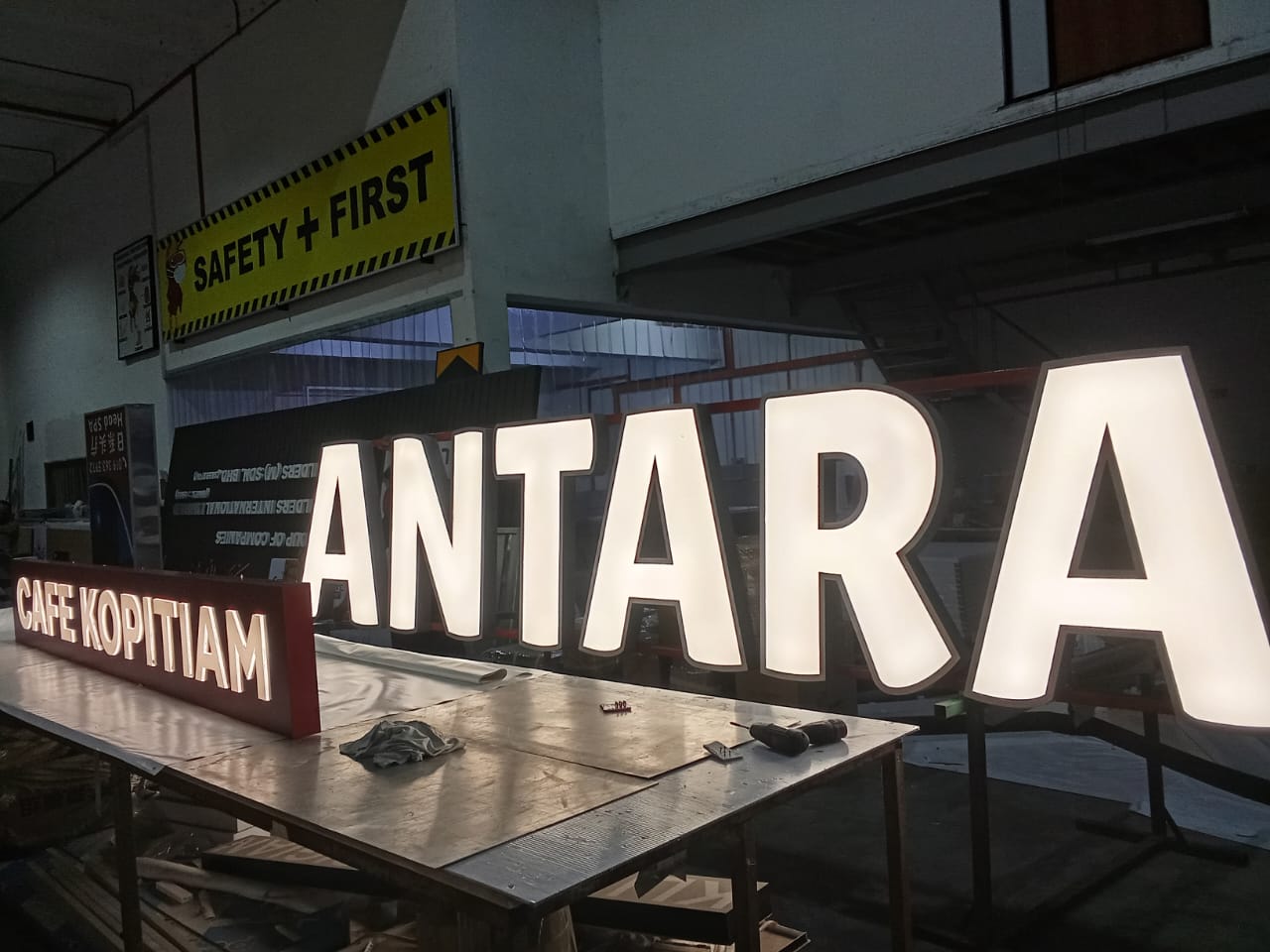
- Main outdoor signboard — “ANTARA” large frontlit aluminium box-up lettering with LED bulb effect inside each letter
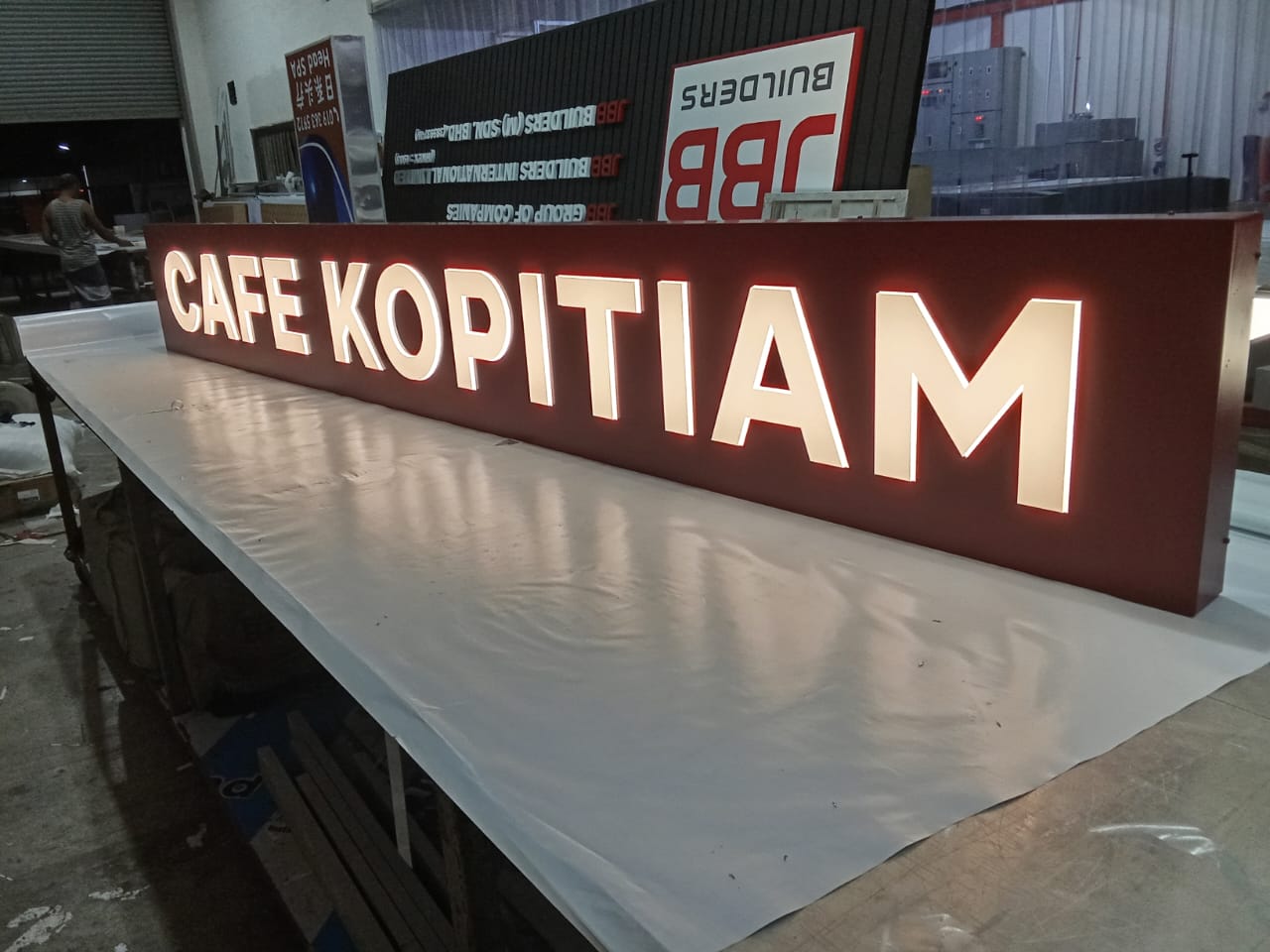
- Crystal lightbox — “CAFE KOPITIAM” backlit crystal lightbox panel mounted alongside the main lettering
- Banner board — promotional display panel (“Sarapan dari RM 5.90”) installed adjacent to the main signboard
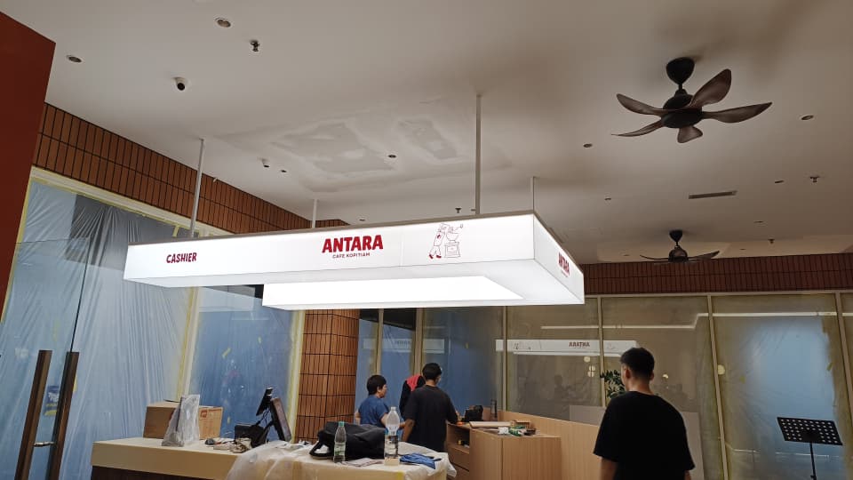
- U-shape acrylic lightbox — large rectangular suspended lightbox above the cashier counter, displaying the brand name and mascot illustration
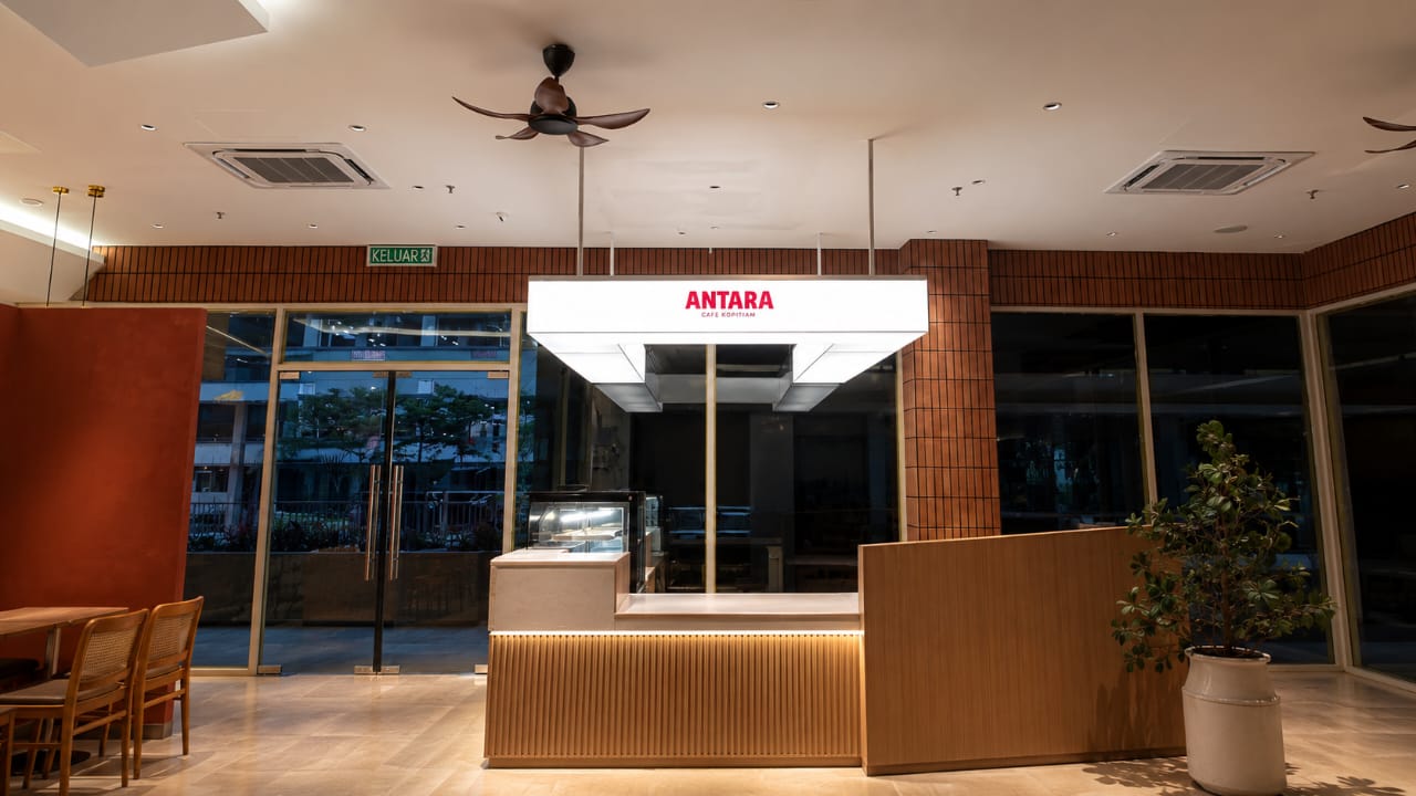
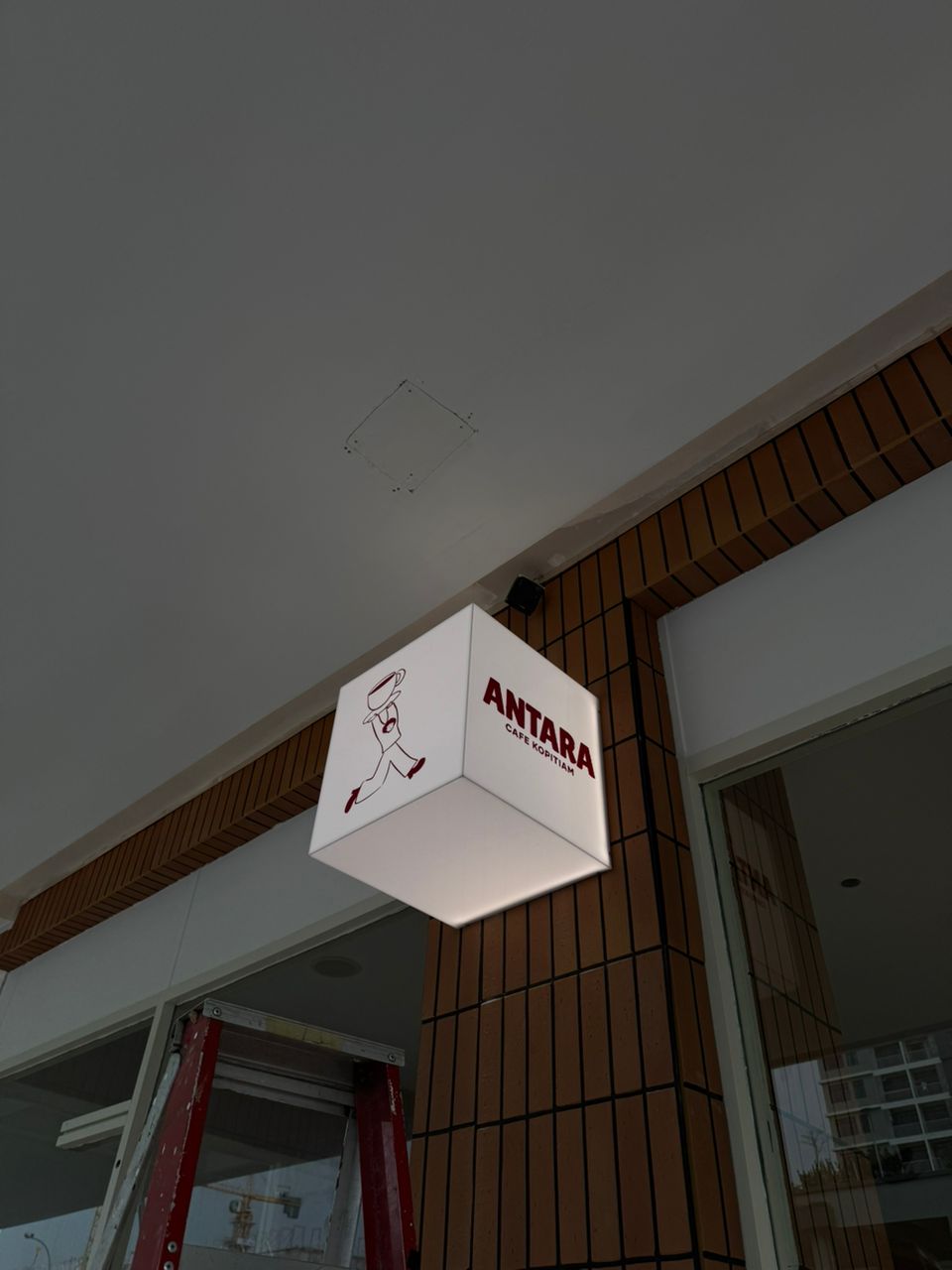
- Outdoor cube acrylic lightbox — single square acrylic lightbox suspended at the shopfront entrance
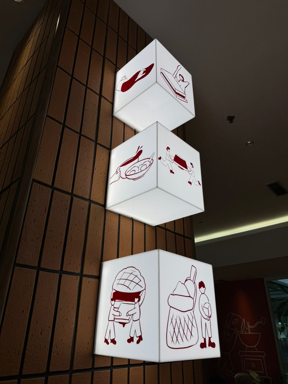
- Decorative cube acrylic lightboxes — three stacked square lightboxes mounted on the interior feature wall, each face printed with the brand’s illustrative characters
The Signage — In Detail
Main Outdoor Signboard — Frontlit Aluminium Box-Up with LED Bulb
The centrepiece of the Antara shopfront is the large “ANTARA” frontlit aluminium box-up signboard. What makes this signboard distinctive is the choice of LED bulb lighting inside each letter — rather than the standard LED strip or module. This creates a visible dot-pattern glow through the acrylic face, giving the letters a vintage marquee aesthetic that sets the signboard apart from a typical frontlit sign. The effect is particularly striking at night, when the individual bulbs are visible through the translucent face panel.
U-Shape Acrylic Lightbox — Cashier Counter
Above the cashier counter, a large U-shape acrylic lightbox was suspended from the ceiling — displaying the Antara brand name and mascot illustration on multiple faces. The U-shape configuration means the lightbox is visible from the front and both sides simultaneously, making it an effective brand identifier for customers approaching the counter from any direction inside the cafe.
Outdoor Entrance Cube Lightbox
A single square acrylic cube lightbox was suspended at the shopfront entrance — carrying the Antara brand name and mascot on its faces. The cube format gives five-sided illumination, making it visible from both inside and outside the cafe entrance. This type of lightbox is particularly effective as a secondary brand identifier at the entrance point, drawing attention even when the main signboard above is not in direct line of sight.
Decorative Stacked Cube Lightboxes — Interior Feature Wall
Three square acrylic cube lightboxes were stacked vertically on the cafe’s interior feature wall — each face printed with a different illustration from the Antara brand character series. This installation functions simultaneously as interior lighting, brand storytelling, and a decorative focal point for the dining area. The consistent illustrative style across all three cubes ties the interior signage together with the outdoor entrance cube and the cashier counter lightbox above.
What This Project Demonstrates
Signage as part of the brand experience
Antara Cafe Kopitiam is a good example of how signage — when planned as a complete system rather than individual pieces — contributes directly to the brand experience inside the outlet. Every lightbox carries the same illustrative character, the same brand colours, and the same quality of finish. A customer sitting inside the cafe is surrounded by consistent brand touchpoints, from the feature wall cubes to the cashier counter lightbox above them.
Using lighting as a design choice
The decision to use LED bulb lighting inside the main “ANTARA” letters — rather than standard LED strips — was a deliberate design choice that gives the signboard a distinctive vintage marquee look. This kind of attention to lighting detail is what separates a memorable signboard from a generic one, and it is the type of decision that A&T’s design and production team can advise on during the consultation stage.
Indoor and outdoor as one package
Many F&B businesses order their outdoor signboard from one supplier and their indoor signage from another — which often results in inconsistent finishes, different white tones, and mismatched brand colours between interior and exterior. A&T produced every piece for Antara Cafe Kopitiam in-house, ensuring that the outdoor signboard and the interior lightboxes share the same material quality, colour accuracy, and finish standard throughout.