Case Study: Giant Freestanding Frontlit Letters for DAYONE Data Centre, Nusajaya JB
When DAYONE Data Centre needed a landmark signage installation for their facility in Nusajaya, Gelang Patah, the brief was clear: large-scale, freestanding, double-faced frontlit letters that would read as a statement from the car park and road approach — not a wall sign, not a fascia, but a full ground-level installation that holds its own against the scale of a data centre building. A&T fabricated and installed the complete “DAYONE” letter set — seven letters standing 1,600mm tall, 500mm deep, spanning 10,850mm across the landscape plinth in front of the facility.
Project Overview
The installation sits in the landscaped forecourt of the DAYONE data centre building — a modern facility with a distinctive perforated aluminium cladding facade and floor-to-ceiling glazing. The letter set mirrors the brand’s two-colour identity: “DAY” in charcoal black and “ONE” in DAYONE’s signature green, matching the building-mounted signage on the facade above. Each letter is a freestanding structure anchored into a concrete foundation, with internal LED lighting illuminating the acrylic face panels from both the front and rear.
Scope of Work
- Structural design and shop drawing — scaled production drawing with per-letter dimensions, internal iron structure specification, anchor bolt layout, and concrete footing depth
- Concrete foundation — continuous reinforced concrete plinth with embedded steel anchor bolts positioned per letter, cast in-situ on site prior to letter installation
- Letter fabrication (7 letters: D-A-Y-O-N-E) — aluminium box-up construction, 1,600mm height, 500mm depth, internal iron frame, double-faced acrylic face panels, internal LED frontlit modules
- Colour finish — “DAY” letters in charcoal black spray; “ONE” letters in DAYONE brand green spray, both 2K automotive-grade paint for outdoor durability
- On-site installation — per-letter placement, anchor bolt fixing, internal LED wiring and connection
The Signage — In Detail
The Shop Drawing — Translating the Brief into a Production Specification
1600mm H · 500mm Depth · 10,850mm Total Span · Avenir Next Bold
Before fabrication begins on a project of this scale, a detailed shop drawing is produced and submitted for client approval — confirming every dimension, the letter spacing, the structural anchoring method, and the font. For this project, the approved drawing specified 1,600mm letter height and 500mm body depth across all seven characters, with the total installation spanning 10,850mm. The human figure silhouette in the drawing gives an accurate sense of the scale: at 1,600mm, the letters stand roughly shoulder-height on an average adult. The font is Avenir Next Bold — a geometric sans-serif with clean curves that translates well into three-dimensional aluminium box-up construction, particularly in the circular “O” and the angled legs of the “A”.
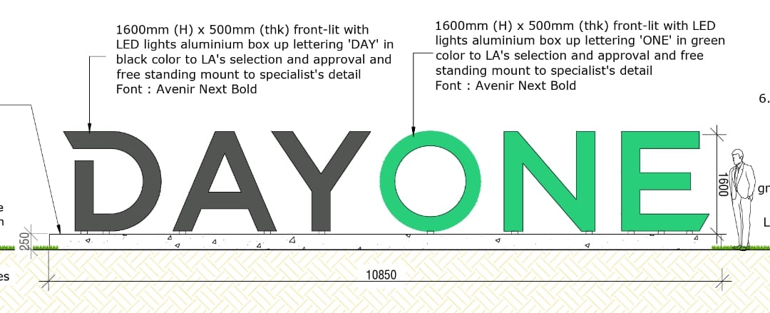
Approved shop drawing — 1,600mm (H) × 500mm (thk) frontlit aluminium box-up lettering, total span 10,850mm · A&T Signboard, JB
Concrete Foundation — Anchoring Letters at This Scale
Freestanding letters at 1,600mm tall and 500mm deep cannot simply be surface-mounted — they require a properly engineered concrete foundation with embedded anchor bolts for each letter. A&T cast a continuous reinforced concrete plinth along the full 10,850mm length of the installation, with steel anchor bolt sets positioned at each letter location according to the shop drawing layout. The anchor bolts project from the concrete surface and correspond to pre-drilled base plates welded to the internal iron structure of each letter. Once the concrete has cured to sufficient strength, each letter is positioned over its anchor bolts, levelled, and torqued down — creating a structurally secure connection between the letter and the foundation that resists wind loading and the weight of the aluminium and iron construction.
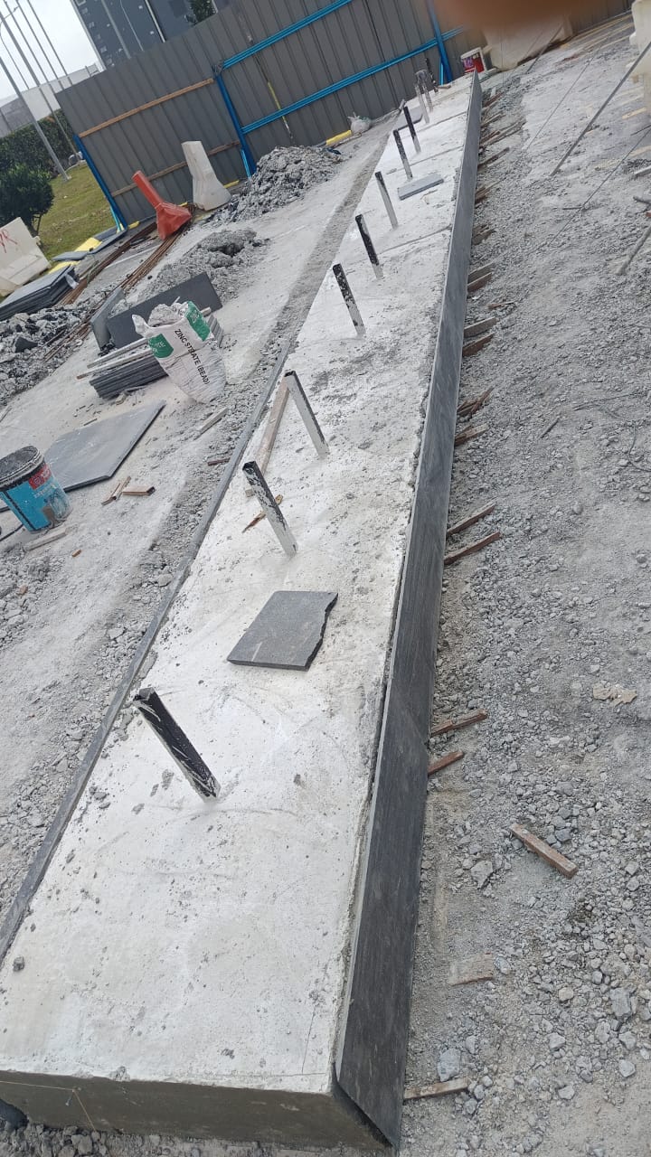
Concrete foundation with embedded anchor bolt sets at each letter position — cast in-situ before letter installation · A&T team on site, JB
Letter Fabrication — Internal Iron Structure and Aluminium Box-Up Body
Each letter is built around an internal iron structural frame — welded steel sections that form the skeleton of the letter shape and carry the load from the letter body down to the anchor bolt base plate. The aluminium box-up panels are then formed and fixed to the outside of the iron frame, creating the letter’s exterior faces, sides, and return edges. At 500mm depth, the letter body is substantial — the side return panels alone are 500mm wide, which is what gives the installation its three-dimensional presence when viewed from an angle rather than straight on.
The “O” presents the most complex fabrication challenge in the set: a full circular ring rather than a standard rectangular letter body. The inner and outer curved faces of the “O” require the aluminium sheet to be rolled to the correct radius, and the internal iron frame must maintain the circular geometry under its own weight during fabrication and transport before it is anchored to the foundation. The factory photograph shows the “O” body mid-fabrication in grey primer — the curved inner ring structure visible before the green topcoat is applied.
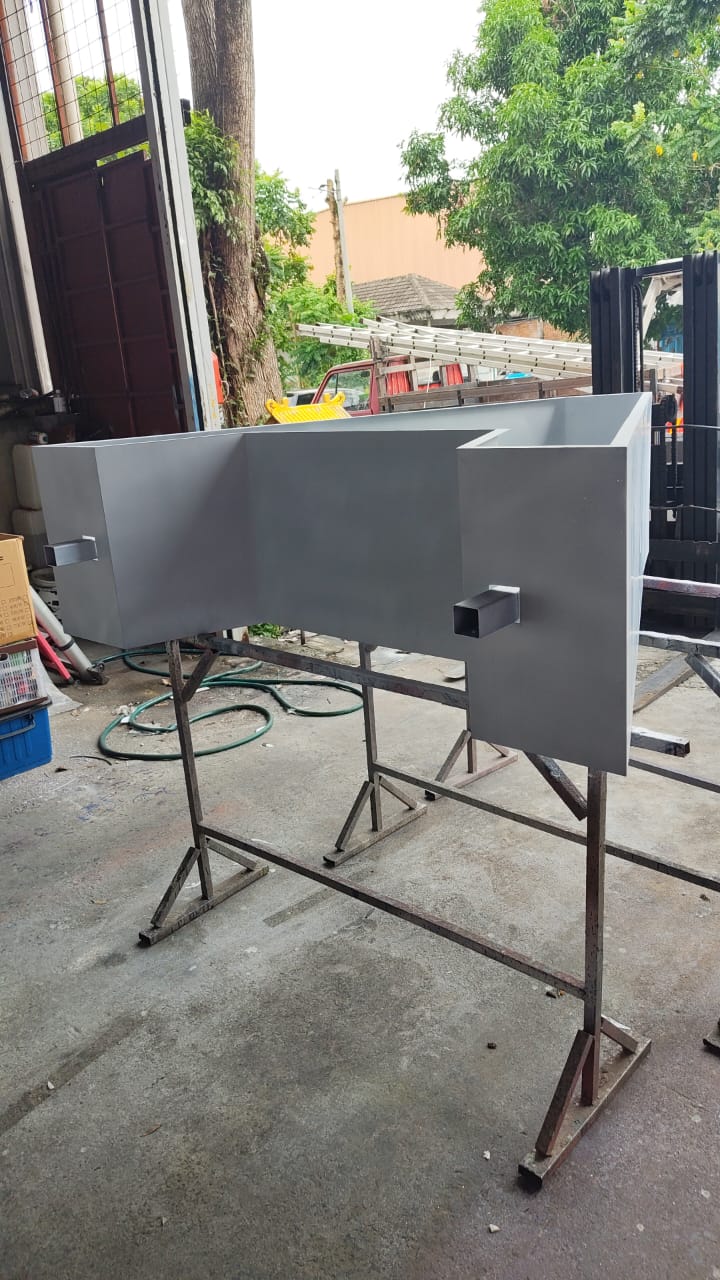
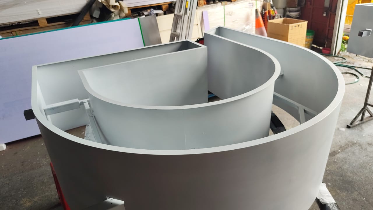
Factory fabrication — internal iron structure (left) and the circular “O” letter body in primer before topcoat (right) · A&T factory, Ulu Tiram, JB
Colour Finish — 2K Spray, Two-Colour Brand Identity
Once the letter bodies are structurally complete, the exterior aluminium surfaces are prepared and sprayed in 2K automotive-grade paint — charcoal black for “DAY” and DAYONE brand green for “ONE”. The 2K two-component coating system is specified for this type of outdoor large-format sign because it cures into a significantly harder surface than standard single-component paint, providing better resistance to UV, heat, and the humidity conditions of Johor’s climate over a multi-year installation lifespan. The factory photograph shows the green “ONE” letters after topcoat, with the acrylic face panels not yet fitted — the open front of the letter body revealing the LED module mounts inside.
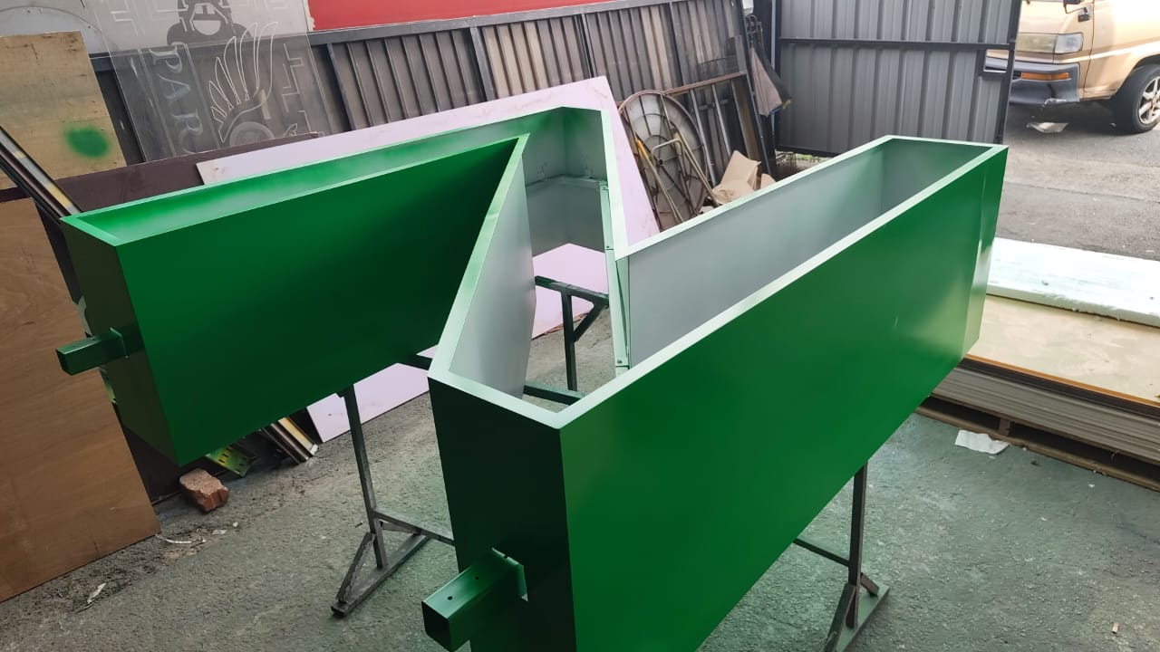
Green “ONE” letter bodies after 2K topcoat application — LED module mounts visible inside the open letter face · A&T factory, Ulu Tiram, JB
Installation — Placing and Securing Seven Freestanding Letters
With the concrete foundation cured and the letters fabricated, spray-finished, and fitted with LED modules and acrylic face panels, installation begins. Each letter is transported to site and positioned over its anchor bolt set on the plinth. At 1,600mm tall and 500mm deep, each letter unit is heavy and requires careful handling to position accurately — spacing between letters matters both visually and in terms of the overall span landing on the pre-cast foundation. The installation photograph shows the “A” and “O” in position with the remaining letters yet to be placed, the anchor bolt base plates visible at ground level against the dark granite plinth cladding.
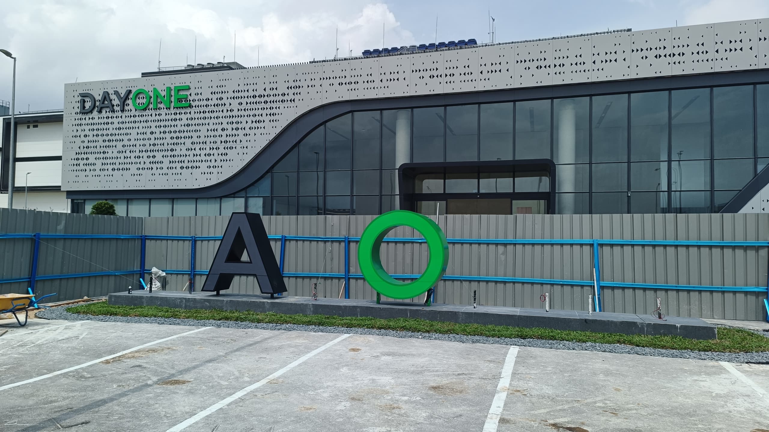
Installation in progress — “A” and “O” positioned on the plinth, remaining letters being placed · A&T team on site, Nusajaya, JB
Completed Installation
With all seven letters anchored, wired, and the LED system commissioned, the completed “DAYONE” installation reads exactly as the brief intended: a bold, freestanding landmark sign at car park level that establishes the facility identity at the scale the building deserves. The two-colour split — charcoal “DAY” transitioning to green “ONE” — mirrors the building-mounted signage on the facade above, creating a consistent brand read from the road approach through to the building itself. At night, with both faces illuminated by the internal LED system, the letters are visible as a lit landmark from the approach road.
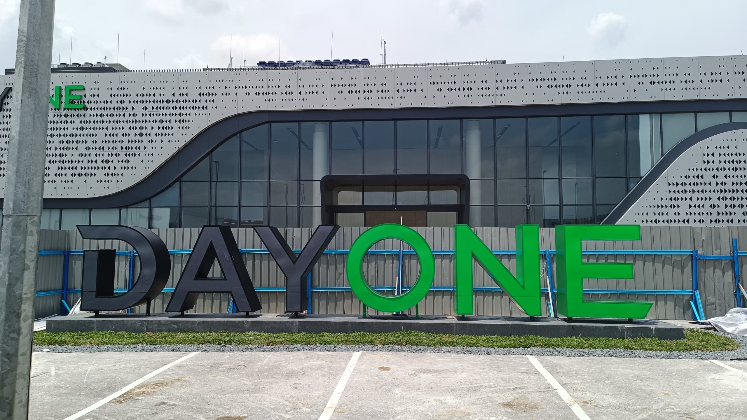
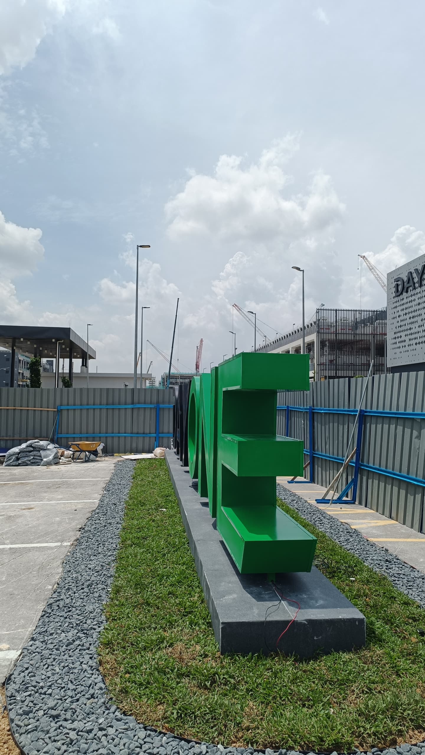
Completed installation — full “DAYONE” letter set at 1,600mm height across 10,850mm span (left); side view showing the 500mm letter depth (right) · Made by A&T, JB
What This Project Demonstrates
Large-format freestanding letters require structural engineering, not just sign fabrication
At 1,600mm tall and 500mm deep, each letter in this installation is a structural object as much as a sign. The concrete foundation, the internal iron frame, the anchor bolt connection, and the 2K coating specification are all engineering decisions, not just fabrication choices — they determine whether the installation is safe, durable, and maintainable over its service life. A sign company that can only produce standard wall-mounted or fascia signs is not equipped to handle a freestanding large-format installation of this type. A&T manages the full scope in-house — from structural shop drawings and foundation work through fabrication and on-site installation — which is what makes this type of project deliverable as a single package.
Data centre and tech campus signage needs to hold up to the architecture
A data centre facility at the scale of DAYONE Nusajaya is a significant piece of infrastructure — the building itself is a statement. Signage that is undersized, poorly finished, or visually inconsistent with the architectural quality of the building undermines the facility’s brand positioning. The decision to go with 1,600mm freestanding letters rather than a smaller wall-mounted sign is the right one for this scale of building and forecourt — the letters hold their visual weight against the facade and read clearly from the road. Getting the scale, material specification, and colour accuracy right on a project like this is what separates a landmark installation from one that just fills the brief.
Frequently Asked Questions
What is the maximum letter height A&T can fabricate for freestanding signage?
A&T has produced freestanding aluminium box-up letters at 1,600mm height for this project. Letter height for freestanding installations is primarily governed by structural requirements — taller letters require heavier internal iron frames, deeper concrete foundations, and more robust anchor connections. There is no fixed upper limit as such; the structural specification is engineered to suit the height and depth of the letters required. Contact A&T with your letter dimensions and we will advise on the structural approach and production feasibility.
What does “double-faced frontlit” mean for a freestanding letter?
Double-faced frontlit means both the front and rear faces of the letter have an acrylic panel with internal LED illumination — light comes out from both sides of the letter body. This is specified for freestanding installations where the sign is visible from multiple directions, rather than wall-mounted signs where only the front face is seen. At 500mm depth, the letter bodies in this project are substantial enough that the side return is also visible at an angle, making the overall silhouette and finish equally important from both the front approach and any oblique viewing angle.
How long does a project like this take from shop drawing to completed installation?
A large-format freestanding letter installation of this scope typically requires 4 to 6 weeks from approved shop drawing to completed on-site installation — allowing time for foundation casting and curing, letter fabrication, spray finishing, LED fitout, transport, and on-site placement and wiring. The concrete foundation needs to reach sufficient curing strength before letters can be anchored, which adds to the schedule. Earlier engagement with A&T during the project planning phase allows the signage timeline to be aligned with the construction handover schedule.
Can A&T match a specific brand colour for the spray finish?
Yes. A&T matches brand colours using the client’s approved Pantone, RAL, or hex colour reference. For this project, the DAYONE green was matched to the brand’s approved colour specification. A colour sample is produced and submitted for client approval before the full letter set is sprayed, to confirm the match before production is committed. This is standard practice on any corporate or branded signage project where colour accuracy matters.
Does A&T handle both fabrication and on-site installation for large-format projects?
Yes — A&T manages fabrication at our Ulu Tiram factory and on-site installation as a combined package. For large-format freestanding sign projects, we also handle the concrete foundation work where required, coordinating the full scope from structural preparation through to completed sign installation and LED commissioning. This means the main contractor or client only needs to engage one party for the complete signage delivery.
Need large-format freestanding signage for a development or facility in Johor Bahru?
A&T fabricates and installs large-scale aluminium box-up letters and landmark signs — from shop drawing and foundation work to completed installation. All production is done in-house at our Ulu Tiram factory. WhatsApp us for a free consultation and quote.
WhatsApp Mr. Tan (+6016-789 1110)
WhatsApp Mr. Albert (+6016-775 5815)